 THE OTHER TAB
Café Project · Part 1 · Episode 02
A page worth
staying for.
A warm café campaign page, plus the design references behind it. Copy the prompt below and adapt it to your own project.
Your copy-and-paste prompt
Make it yoursUse the references for hierarchy, spacing and atmosphere. Build an original page around your own café’s story.
Build a desktop-first, mobile-friendly campaign page for an illustrative neighbourhood café expansion. Use the working name “Café Project”. First inspect my existing framework and components; keep the current stack.

Design direction: a welcoming café, not a trading terminal. Use warm cream, dark ink, a forest-green primary action, thin dividing lines, restrained type and generous space. At desktop width, put the venue story/illustration on the left and an easy-to-read campaign summary on the right. On a phone, stack the story, key facts and action in a sensible reading order. Use original copy and original or properly licensed imagery.

Give the page one clear story: “More room for your usual.” The example expansion adds a community table, a reading corner and seats. Let visitors read the plan before sign-in. Include a concise use-of-funds section and an illustrative budget; do not invent a deadline, testimonials, ownership, returns or investment terms.

The summary must show the goal, provider-confirmed test-payment total, test-supporter count and one “Back this café” button. Use the campaign API as the source of totals; while it loads, show a loading state, and show a retry message on error. Never substitute fictional activity for a failed API request. Keep clear TEST labels beside payment totals.

The button leads to the contribution journey and requests sign-in only when needed. Keep keyboard focus visible, use real labels and an accessible progress indicator, and respect reduced motion. Prevent horizontal overflow at phone widths.

For visual inspiration, examine these public Aura references:
https://www.aura.build/templates/cafelittlelatte
https://www.aura.build/templates/fluxa-fintech
Translate their spacing, hierarchy and balance into an original café page. Do not copy template code, imagery, testimonials, lending claims or brand assets.

Show me the finished desktop and phone layouts. Verify that the campaign can be read while signed out, the main button reaches the correct next step, loading/error states are readable, and the page works with the keyboard. If there is no backend yet, use clearly labelled fixtures and say exactly what remains to connect.
An original prompt from The Other Tab. No account needed.
The useful links
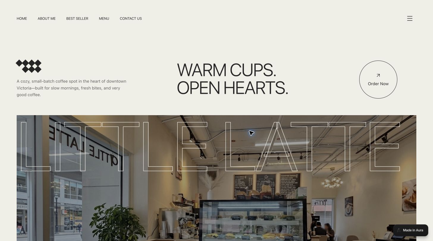
Aura · Little Latte
Warm café editorial design reference
Aura · Fluxa
Campaign information hierarchy and layout reference